Nov 2025 - Mar 2025
Creating a Driver-Led Order Ecosystem
to Boost Acceptance
Order acceptance rate
8%
Adoption of filters
3.4x
27%
Average idle minutes


Executive Summary
18%
Post login
Order acceptance rate
Rapido Captain powers one of India's largest mobility marketplaces, connecting millions of riders with bike, auto, and cab drivers across the country. As the Auto category expanded, one problem quietly became more visible.
Drivers were coming online consistently, but they weren't accepting enough work.
Average idle time had reached nearly 15 minutes per session, post-login acceptance had dropped to 18%, and fulfilment continued to decline.
The initial ask from the product team was straightforward:
"Can we improve order acceptance?"
The obvious assumption was that drivers were becoming increasingly selective. After spending time in the field, we discovered something very different. Drivers weren't rejecting orders because they were disengaged. They were rejecting them because the marketplace had no understanding of how each driver wanted to earn.
That insight completely changed the direction of the project. What began as an initiative to improve order acceptance became an opportunity to introduce driver intent into the marketplace itself.
Why This Problem Mattered
At first glance, low acceptance looked like a behavioural issue. The obvious assumption was that drivers were being selective or ignoring incoming requests. However, looking beyond the numbers revealed something much bigger.
Every rejected order created a chain reaction throughout the marketplace. This wasn't simply a UX problem. It was a marketplace problem that surfaced through the driver experience.

Earnings lost
Drivers spent a real chunk of their online time idle or rejecting orders that didn't fit, which slowly eroded their trust in the platform as a dependable income source.

Lower fulfillment
Every rejection meant a reassignment, a longer rider wait, and a less efficient marketplace overall.

Driver churn
When drivers feel out of control, they disengage — go offline earlier, or multi-app to Uber and Ola. Long-term supply stability takes the hit.
The Challenge
Three things made this genuinely hard to solve:
The root cause wasn't obvious. Acceptance rate is a downstream metric — it can be moved by pricing, the matching algorithm, UX friction, or driver intent. Untangling which one required real research before any pixels.
Driver goals conflicted with the business goals. The platform wanted maximum fulfilment. Drivers wanted maximum control. Those goals pull in opposite directions, and any solution had to respect both rather than pick a side.
Our users had diverse gigital literacy. Our users are auto drivers across Tier 1–4 cities. Whatever we built had to work for someone who may not read English fluently and has little patience for a complex interface.
Everything pointed to one question.
Why were drivers saying no?
My role
As the Lead Product Designer, I was responsible for defining both the product direction and design strategy.
Strategy
Reframed the problem
Created the product strategy
Designed phased rollout
Research
Field study
18 Drivers
6 Days
Leadership
Aligned Product
Engineering
Business
Execution
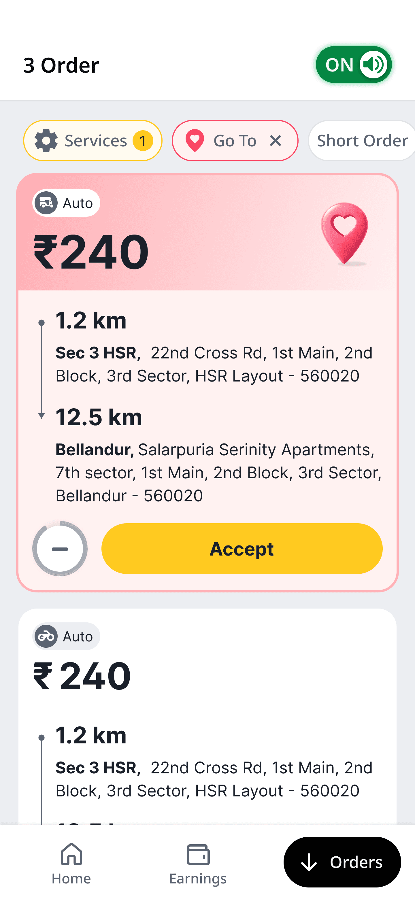
Orders Home
Driver Preferences
Design System
Understanding the Marketplace
Before exploring solutions, I wanted to understand a simple question:
Why were drivers saying no?
The dashboard told us what was happening, but it couldn't explain why. Acceptance rate is a lagging metric. It can be influenced by pricing, dispatch logic, marketplace supply, incentives, or product design. Optimising the interface without understanding the underlying behaviour would simply improve the symptom rather than solve the problem.
Instead of starting with screens, we spent time understanding how drivers actually worked.
Research
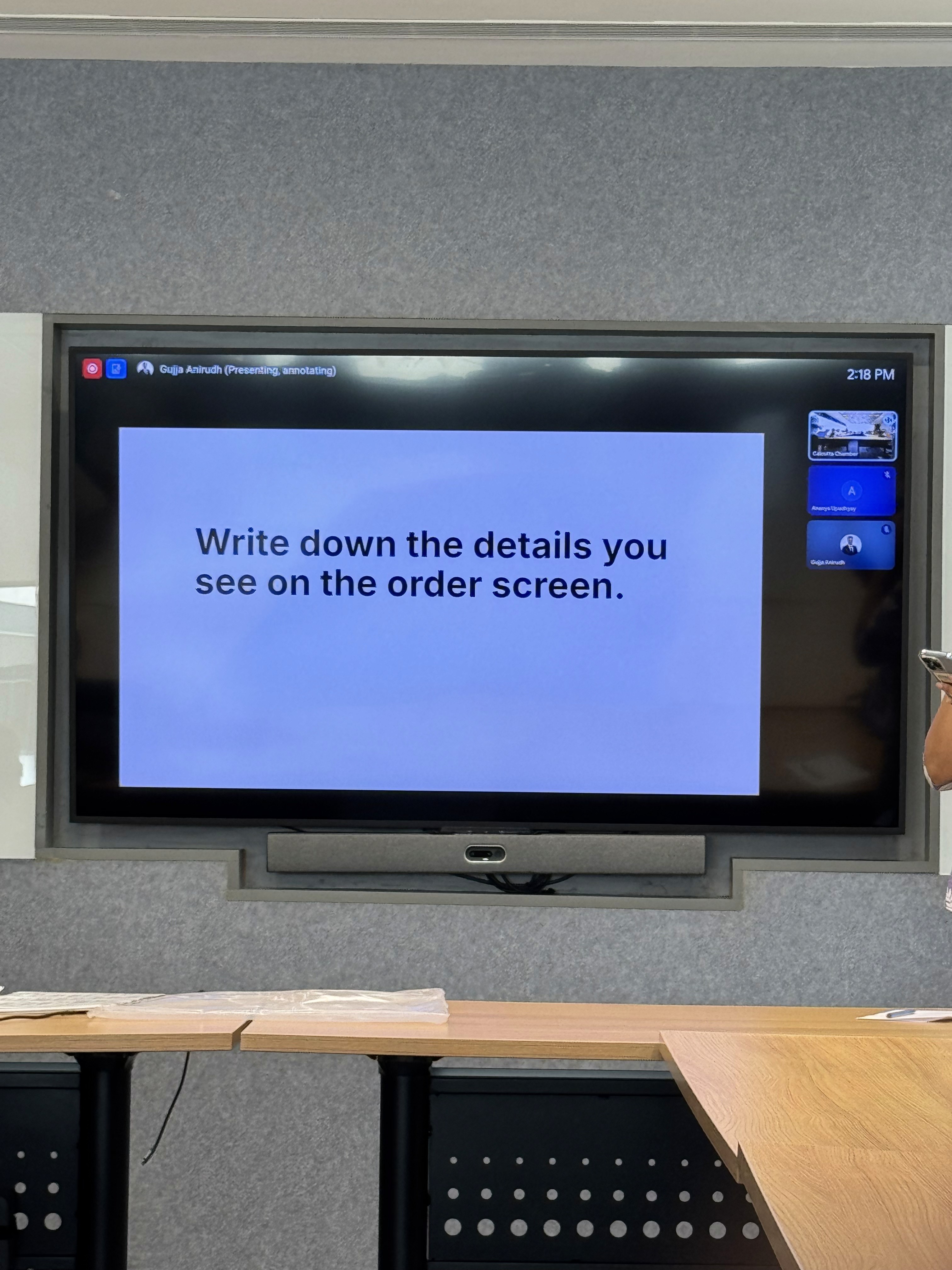
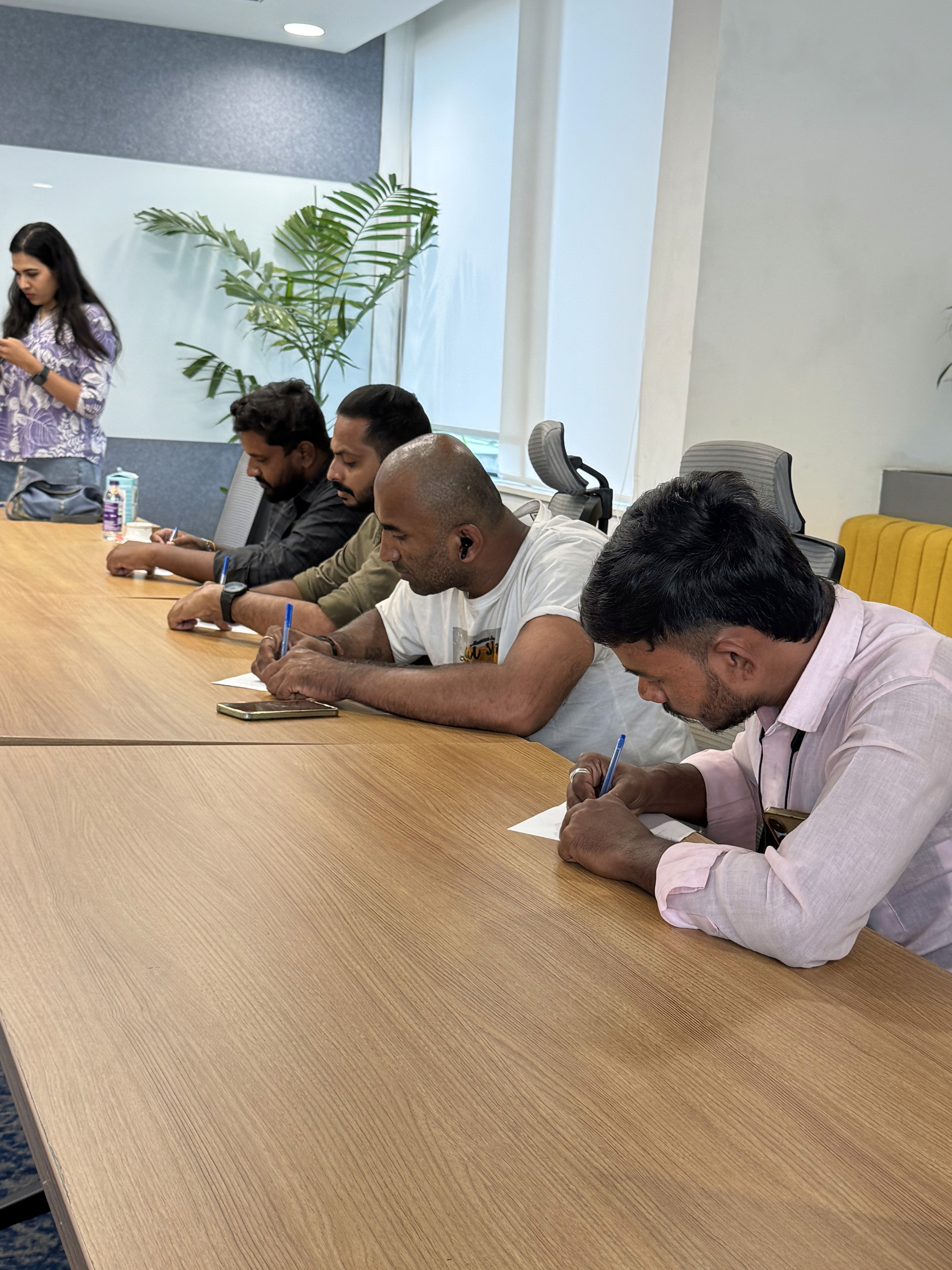


Over six days, we conducted field research with 18 active Auto drivers across Bangalore. Rather than interviewing them inside an office, we observed them during live shifts, understood how they chose rides, and discussed how they made earning decisions throughout the day.
We also revisited an existing feature called Go To Area. Despite solving a genuine need, adoption remained below 12%. Initially, this suggested that drivers weren't interested in personalising their experience. The field study revealed the opposite. Most drivers either didn't know the feature existed or discovered it too late in their journey. The issue wasn't demand. It was discoverability.
6 Days
Research
"I didn't even know Go To Area existed. If I had, I'd use it every night when I want to head home."

Full-time auto driver
6 yrs on the platform
18
Drivers
"This app is my monthly income. I only take trips above ₹200 — I want to earn more per ride, not just more rides."

Full-time auto driver
3 yrs on the platform
"I drive part-time. I want short orders, and I want to stay near my area."

Part-time driver
1 yr on the platform
The Insight That Changed the Project
This project stopped being about improving acceptance the moment we reframed the problem. The marketplace assumed every available driver wanted every available order. Reality was far more nuanced. Every driver came online with a different earning strategy, yet the system treated supply as if every driver behaved the same way.
Instead of asking,
"How do we increase acceptance?"
We started asking,
"How might we help the marketplace
understand what each driver actually wants?"
That single shift changed every design decision that followed.
Exploring the Solution Space
Instead of immediately designing a new interface, I explored different ways the marketplace could understand driver intent. Working closely with Product and Engineering, we evaluated three possible approaches.
The first introduced preferences directly into the Orders experience.
The second captured preferences during onboarding.
The third allowed drivers to change their earning intent throughout the day.
Our research quickly eliminated the onboarding approach. Drivers didn't have one fixed earning strategy. Their priorities constantly changed depending on the time of day, location, and remaining working hours. That made dynamic preferences the strongest direction.
AI-assisted Prototype
A
Orders screen with preference filters
A dedicated space where drivers choose the trip types they want (short, long, stay-in-area) and the live stream reshuffles to match.
B
Preferences captured during onboarding
The same controls surface on day one, so a driver's first session already reflects how they want to earn.
C
Preferences editable from the home screen
Adjustable mid-shift without digging through settings, because intent changes between the morning rush and the late-night ride home.
Aligning Stakeholders
Although the research was compelling, introducing driver preferences immediately raised concerns across the organisation.
Product worried that allowing drivers to choose their work would reduce fulfilment.
Business questioned whether personalisation would fragment marketplace supply.
Engineering challenged whether the implementation effort was justified without stronger evidence.
All three concerns were valid. Rather than trying to convince stakeholders with assumptions, I shifted the conversation towards experimentation.
"Will this reduce overall fulfillment?" Will they take regular orders?

Product Lead
Driver Product Team
"Will supply become fragmented across preferences?"

Manager - Business
Business Team
"This is an expensive build. What's your confidence level?"

Engineering Lead
Engineering Team
Reframing the Investment
Instead of asking the organisation to commit to a large product initiative, I proposed treating the project as a series of experiments. This changed the conversation completely. The objective was no longer to prove that driver preferences were the right solution. The objective became reducing uncertainty one step at a time.
By reframing the work as a phased investment, Product, Business, and Engineering aligned around learning before scaling.
That shift created enough confidence for the project to move forward.
Designing a Phased Rollout
We broke the work into two deliberate phases.
Phase 1
Validate behavior
The first release included:
Orders screen with filters
Filter setup flow
Resurface the Go To Area feature
Order card redesign
Bottom Navigation
Phase 2
Scale the system
Designs to create:
New services and features
Pickup-clarity improvements
Service manager
Order-card system at scale
Minimized bottom navigation
A Strategic Principle
Throughout the project, one principle guided every design decision.
🧠 Core idea
The marketplace should adapt to the driver's intent—not force the driver to adapt to the marketplace.
Designing the Marketplace Experience
Once the strategy was validated, the challenge shifted from what to build to how to build it. The experience had to satisfy two competing goals. Drivers needed to feel more in control of the orders they received. At the same time, the marketplace still needed enough flexibility to maintain fulfilment and dispatch efficiency. Every design decision became a balancing act between individual driver needs and marketplace health.
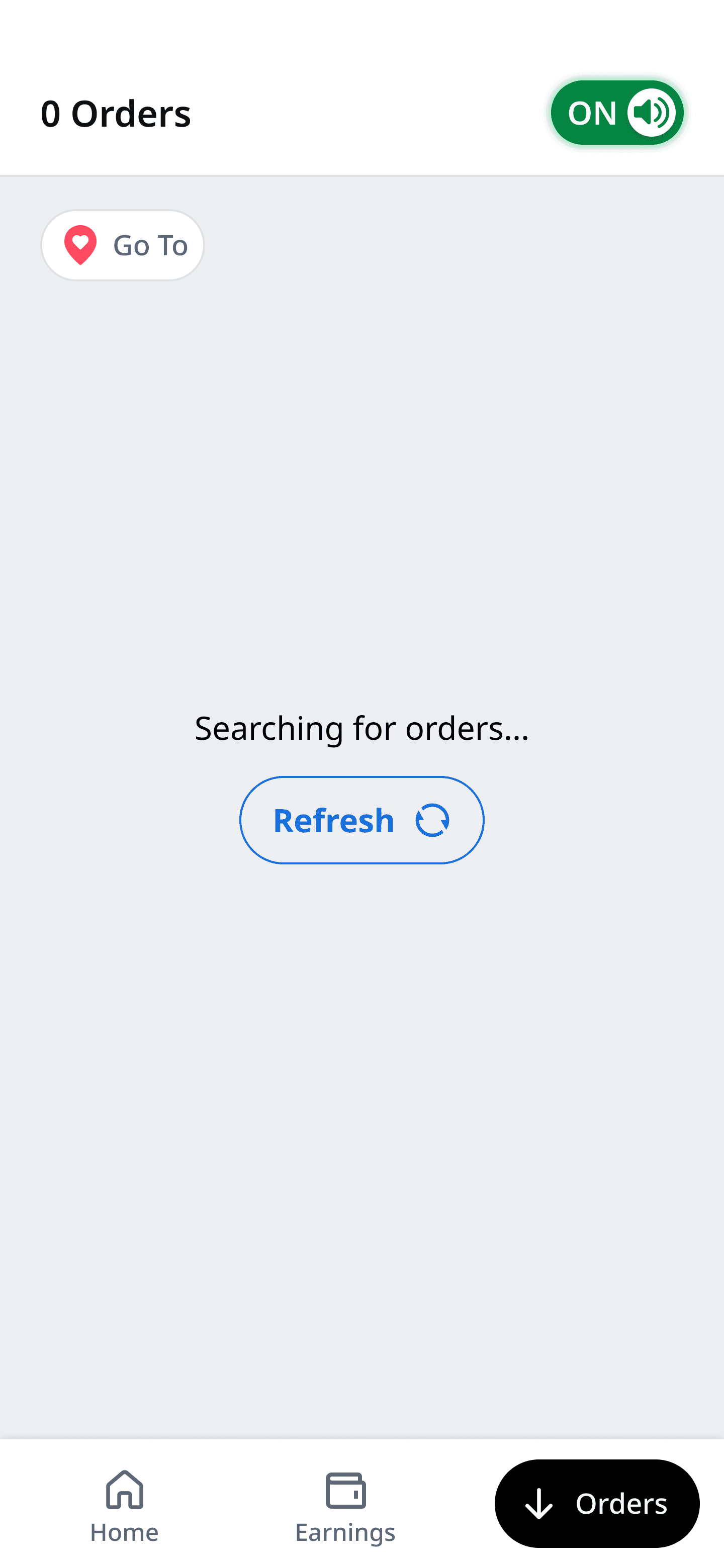
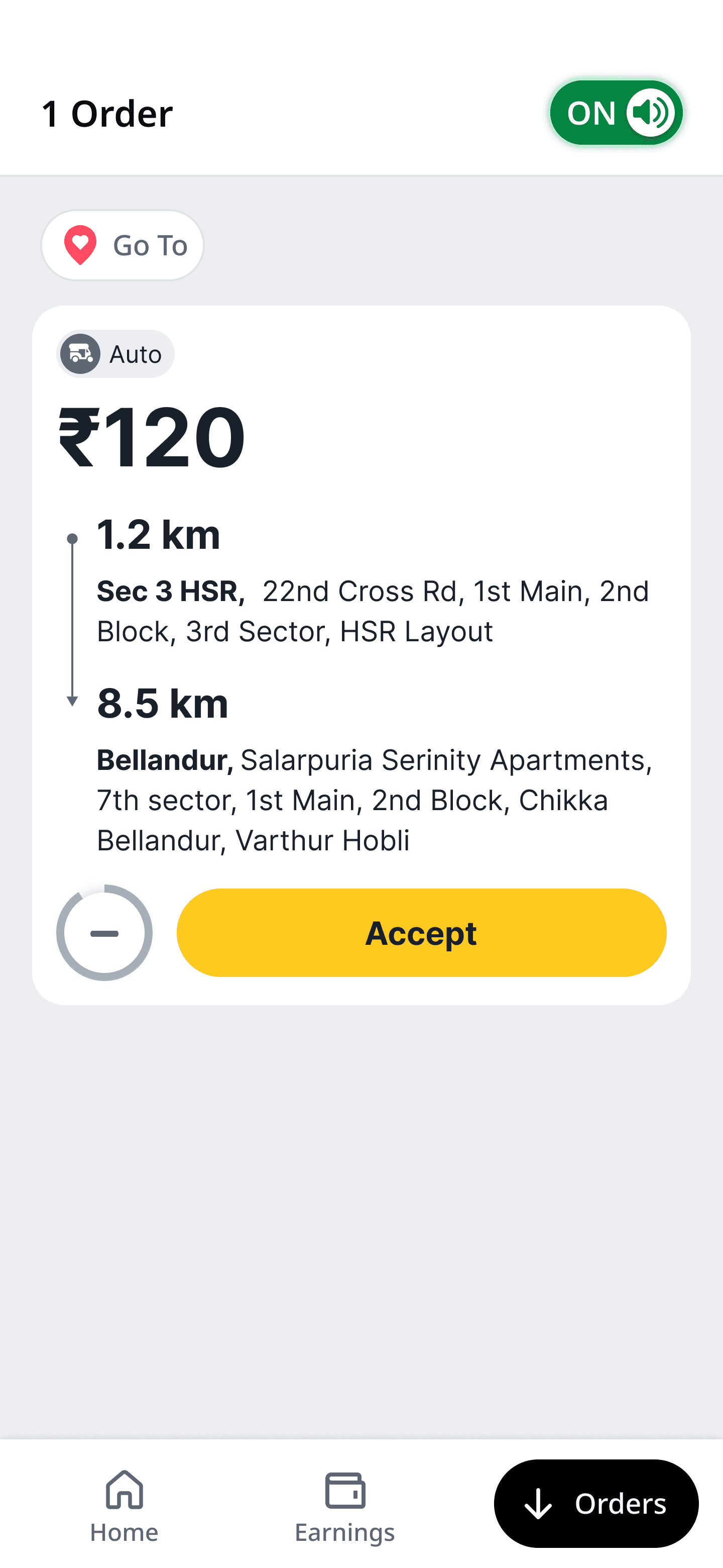
A dedicated Orders Home
I introduced the bottom navigation so orders had their own mental space — separate from the home screen's noise. When nothing's coming in, the screen reads "Searching for orders…" instead of showing a blank empty state. A small detail, but it builds patience instead of anxiety.
Orders Home
New Order Card
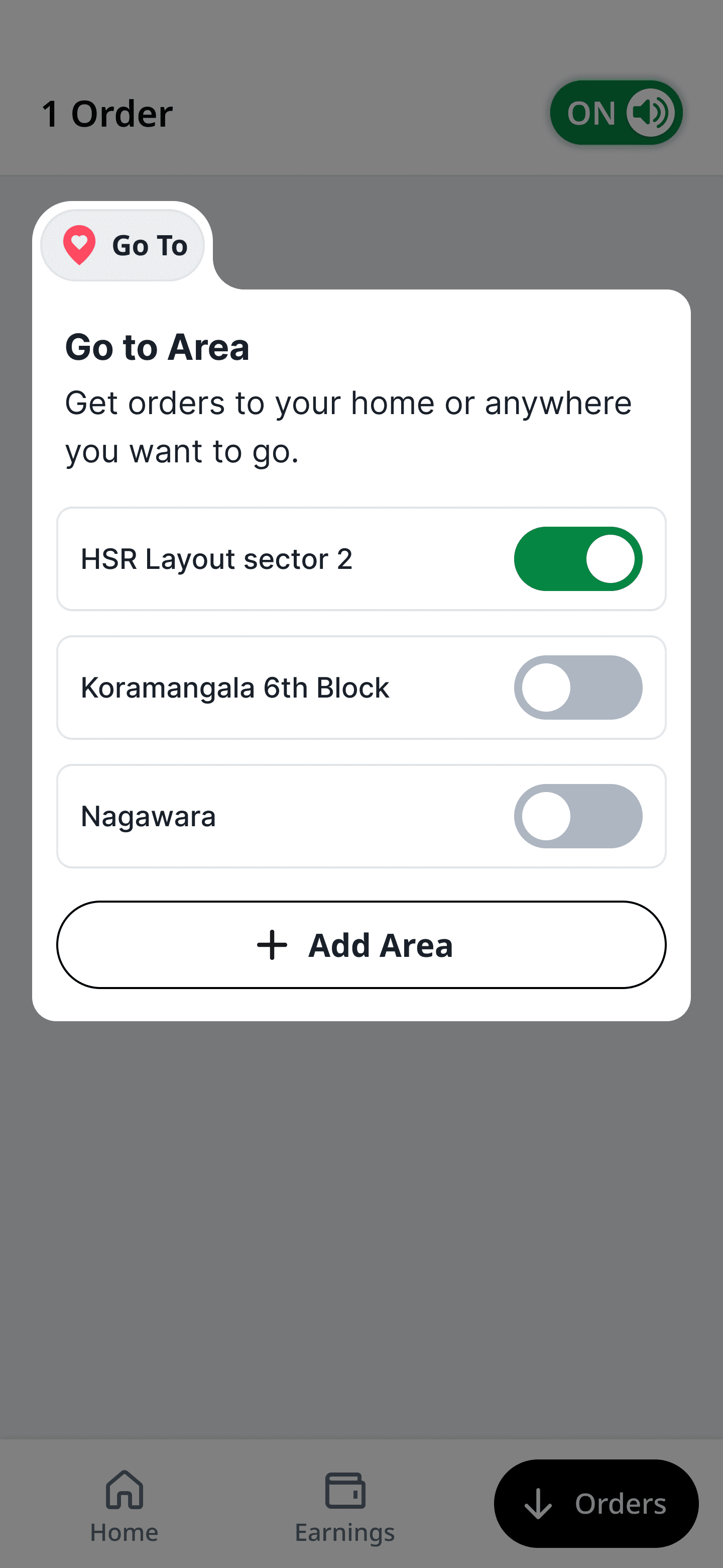
Setting up the filters
The filters let a driver shape their stream in seconds: Short Orders, Long Orders, Stay in Area, Go to Home. Selecting one immediately re-ranks incoming trips and shows a clear confirmation banner — "Short orders active — you'll see trips under 5 km near you" — so the driver always knows the system heard them.
Setting up the Filter
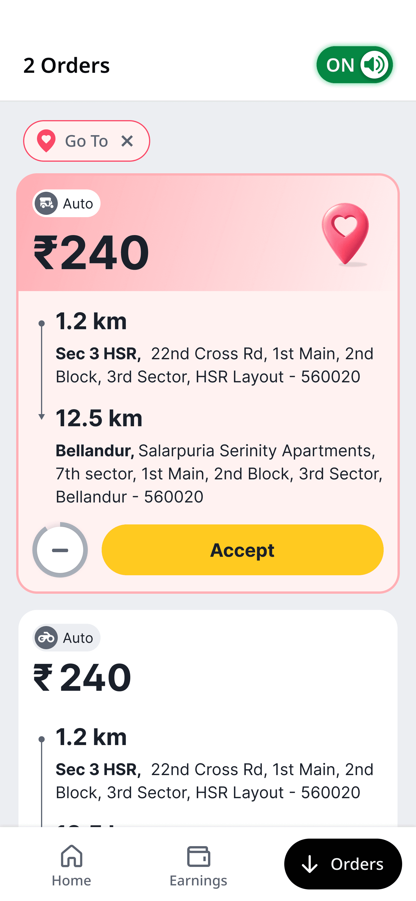
Order card with theming
Designing for Trust Instead of Features
One insight repeatedly surfaced during research.
Drivers didn't simply want more controls.
They wanted confidence that those controls actually mattered.
Rather than hiding preferences inside menus or settings, we treated them as part of the driver's active earning session.
The experience continuously reflected the driver's current intent.
Preferences became visible, editable, and reversible throughout the shift.
The goal wasn't adding functionality.
It was making control feel tangible.
Order card with theming
Identification icon
A thematic card and icon to identify the preferred order that was set by the driver
One Stream or Two?
The most debated design decision during the project wasn't visual.
It was architectural.
Once preferences were introduced, we explored two different approaches for displaying incoming orders.
Option 1
Separate tabs.
All Orders
Preferred Orders
Initially, this appeared intuitive.
Drivers could explicitly choose between general supply and personalised supply.
Several members of the team preferred this approach because it clearly separated different types of work.
However, after mapping driver behaviour against marketplace outcomes, I believed this introduced a much larger problem.
If the Preferred tab became temporarily empty, drivers wouldn't patiently wait.
They would open Uber or Ola.
During research we repeatedly observed drivers switching platforms whenever they experienced even short periods without relevant work.
Creating an empty tab unintentionally encouraged exactly that behaviour.
The interface would be optimised.
The marketplace would suffer.
Option 2
A single intelligent stream.
Instead of separating preferred and regular orders, every incoming order remained in one continuous feed.
Orders matching the driver's preferences simply appeared higher in the ranking.
Nothing disappeared.
Nothing required switching contexts.
The marketplace continued functioning as one ecosystem.
Drivers naturally encountered more relevant work without needing to think about where it appeared.
I strongly recommended this direction.
It reduced cognitive load, eliminated unnecessary interaction, and most importantly preserved marketplace liquidity.
Looking back, I believe this became one of the most important product decisions of the project.
We weren't designing a list.
We were protecting driver attention.
Tabs
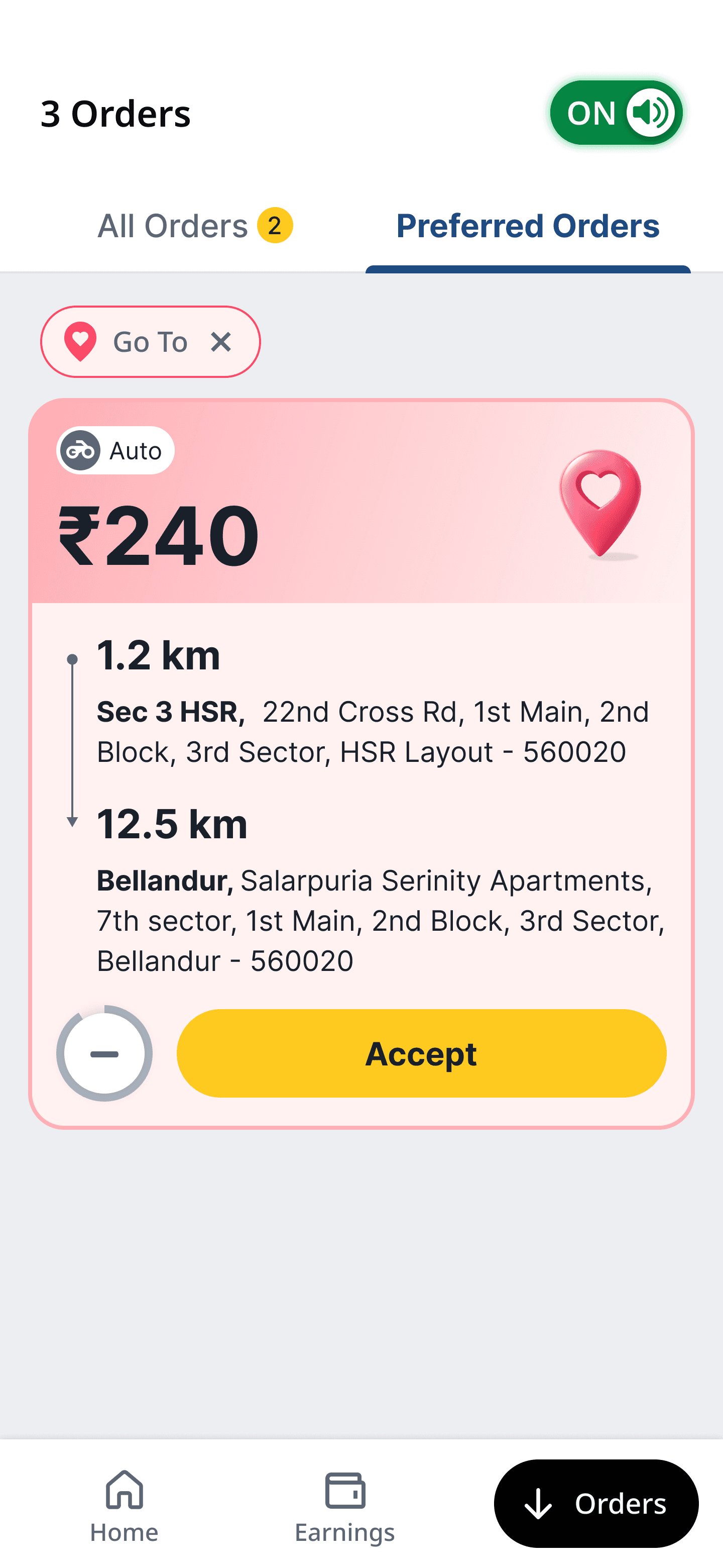


V/S
No Tabs
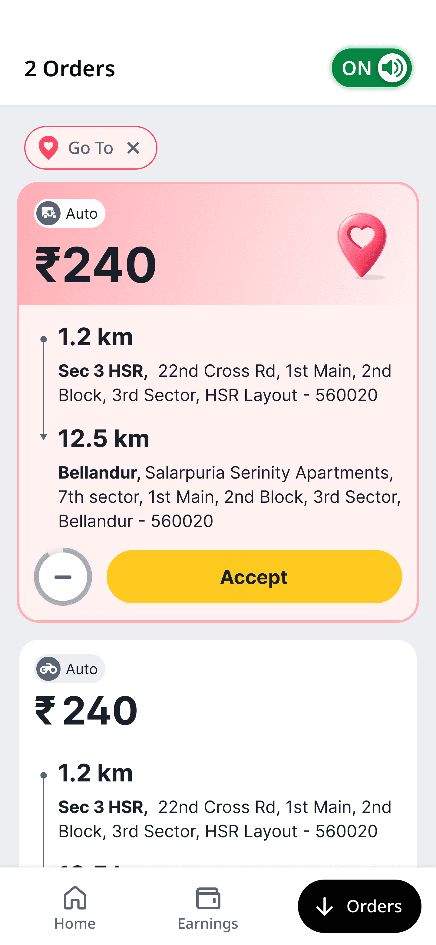
Why I pushed for "no tabs"?
Cognitive switching
Two tabs mean two lists to track and a constant toggle between them.
Multi-apping
A half-empty "Preferred" tab leaves drivers waiting — and a waiting driver opens Uber or Ola.
No interaction
In one stream, preferred orders rise to the top on their own — no tab to open, no switch to remember.
No interaction
In one stream, preferred orders rise to the top on their own — no tab to open, no switch to remember.
Learning Before Scaling
Rather than rolling the solution out nationally, we deliberately limited the first release.
The experiment launched across Bangalore and Hyderabad using selected Auto clusters.
The objective wasn't rapid expansion.
It was learning.
We closely monitored four questions.
Were drivers discovering preferences?
Did they continue using them after the first session?
Did acceptance improve?
Could we improve those metrics without negatively affecting fulfilment?
The early results gave us confidence.
Preference adoption exceeded expectations.
Idle time reduced.
Acceptance increased.
Most importantly, marketplace fulfilment remained stable.
That evidence gave Product and Engineering confidence to invest in a much broader platform.
The experiment had validated not only the design but the strategic direction itself.

41%
Filter adoption
−4 min
Idle time per shift
+8%
Order acceptance
Scaling Beyond Preferences
Once we proved drivers actively wanted to communicate their intent, the project evolved beyond order filtering.
The same interaction model naturally expanded across multiple marketplace capabilities.
Instead of designing individual experiences for every future service, we began treating driver intent as a reusable platform capability.
This allowed us to extend the ecosystem across:

Bike Taki

Auto

Cabs
while also supporting additional earning programmes such as:
Services
Auto Boost
Auto Line
Meter Auto
Features
Short Orders
Long Orders
Stay in Area
Rather than creating separate interfaces for each service, drivers experienced one consistent mental model regardless of what they enabled.
The marketplace became increasingly capable without becoming increasingly complicated.
That scalability became one of the project's biggest long-term advantages.
Making Existing Services Discoverable
The Service Manager already existed elsewhere in the app.
The problem wasn't functionality.
It was discoverability.
Many drivers never activated services like Auto Boost or Meter Auto simply because those controls lived outside the flow where they made earning decisions.
Since the Orders Home had become the place where drivers prepared for every shift, I integrated service management into the same experience.
This allowed drivers to configure how they wanted to earn and what kinds of orders they wanted to receive without leaving the Orders workflow.
Order Page - Setting up the filter
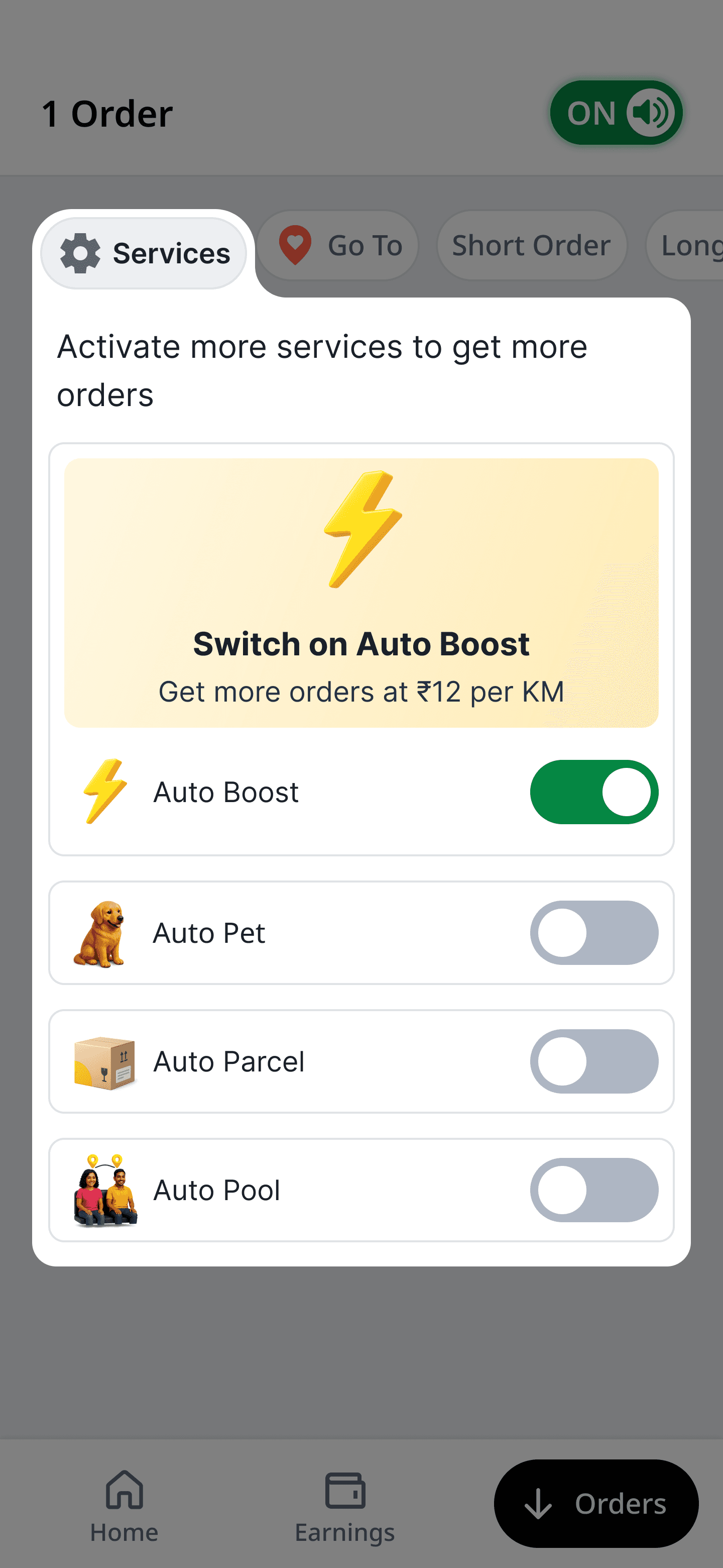
Service expectation
Setting an expectation and explanatory of a particular service
Design Decision: Should every service be exposed, or should they live inside
one Services pill?
Once we moved service management into the Orders experience, we explored two approaches.
Option A — Expose every service
Each earning programme appeared as its own pill alongside the order preferences.
Pros
Maximum visibility.
One-tap access.
Easier discovery for new services.
However, this approach introduced several problems.
As more earning programmes launched, the top navigation quickly became crowded.
Many services were only relevant to a subset of drivers.
For example, a driver who never accepted Parcel deliveries still had to see the Parcel control every single day.
Instead of increasing discoverability, the interface gradually became noisy and harder to scan.
Option B — Contain services inside a single Services pill
The alternative was grouping every earning programme behind one clearly labelled entry point.
Drivers could still discover and manage every service, but the Orders Home remained focused on what mattered most during a live shift: incoming work.
This approach introduced one additional tap during setup.
However, configuration is an occasional task, while scanning incoming orders happens hundreds of times every day.
I deliberately chose to optimise the repeated behaviour rather than the occasional one.
That decision also created a scalable foundation.
As new earning programmes launched, they could simply be added inside the Services Manager without redesigning the Orders Home or introducing more visual clutter.
The result was a cleaner interface, a more focused earning experience, and a scalable interaction model that could evolve alongside the marketplace.
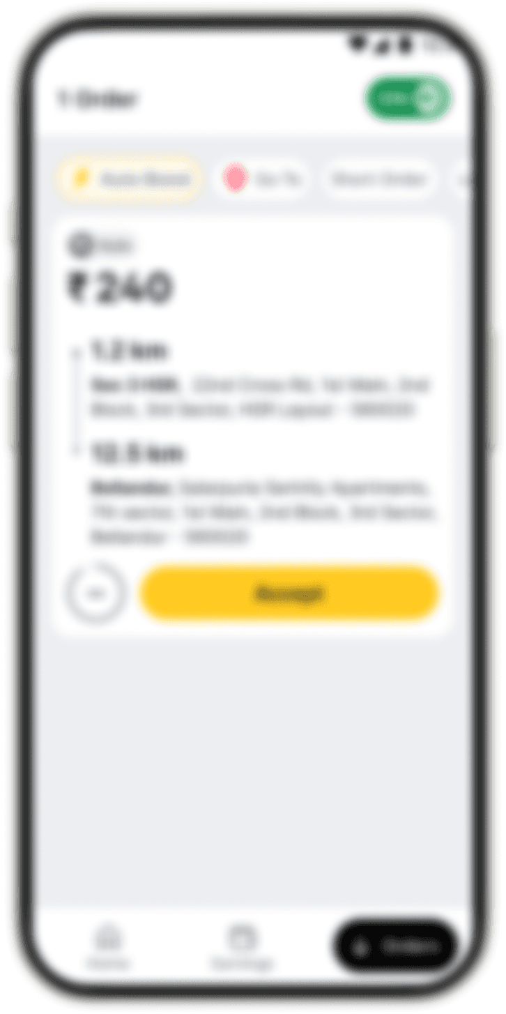
Exposed services

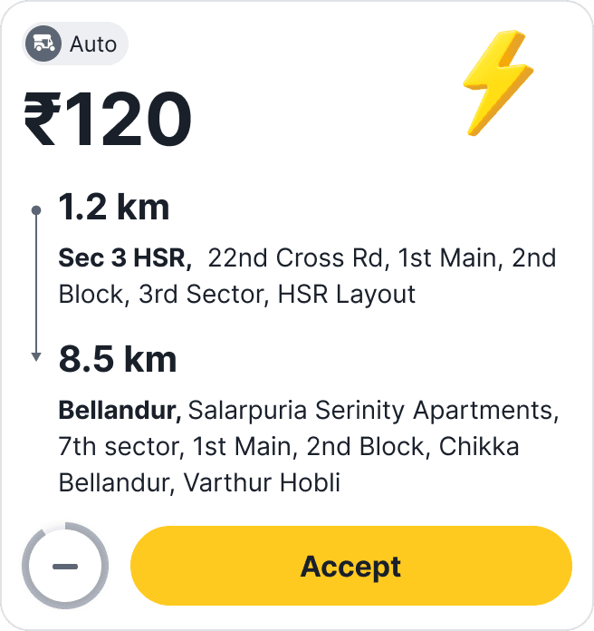
V/S
Contained inside a pill

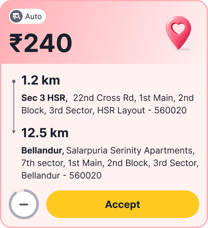
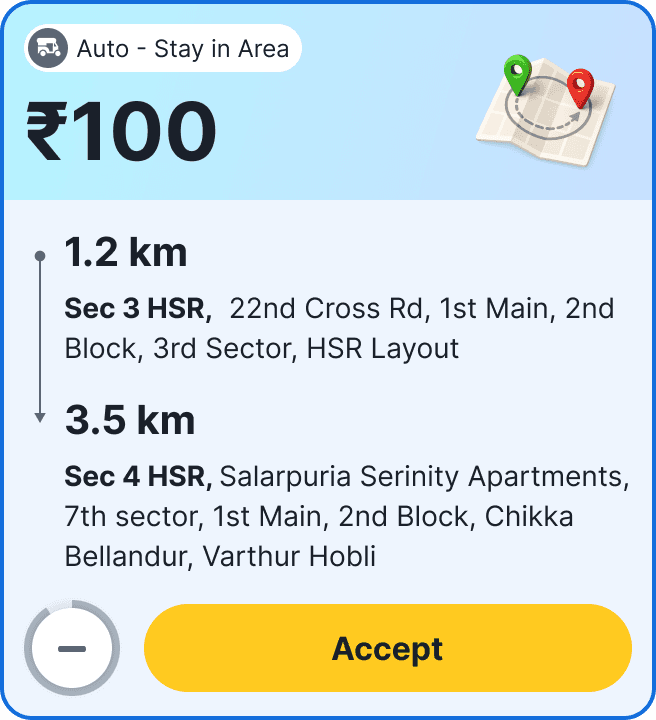
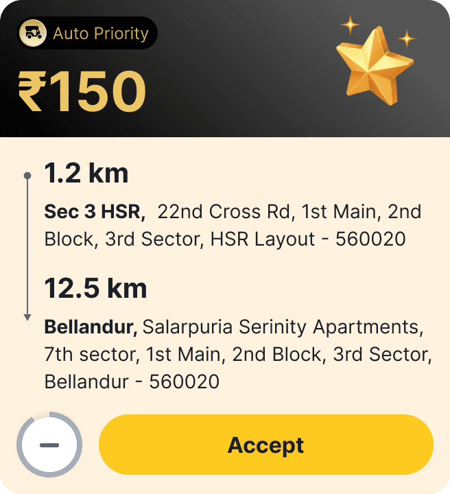
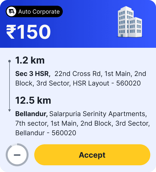
Designing a System, Not Individual Screens
Perhaps the most valuable outcome of the project wasn't the filters or the new navigation.
It was recognising that our order cards were becoming impossible to scale.
Every new service introduced another variation.
Different layouts.
Different colours.
Different metadata.
Different behaviours.
Continuing to design individual screens would eventually become unmanageable.
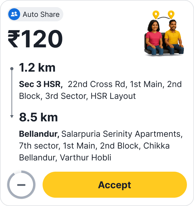
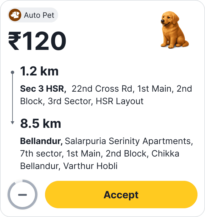
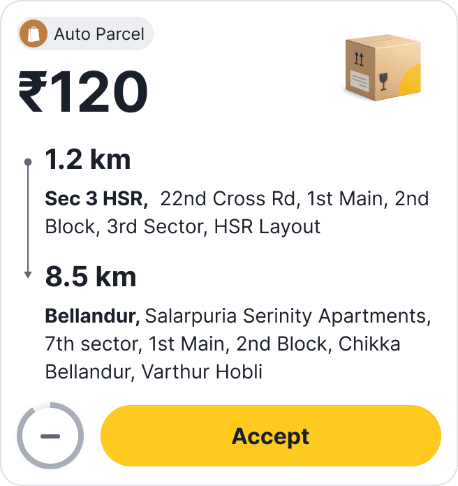
Instead, I led the creation of a modular order-card system.
Each card shared the same underlying structure.
Service type, order state, priority, and contextual information became configurable rather than redesigned.
This transformed the work from interface design into product infrastructure.
It also became an important mentoring opportunity.
Working alongside two designers, we established reusable patterns that significantly reduced future design effort while ensuring consistency across every marketplace experience.
Instead of shipping another collection of screens, we created a design system the product team could continue building on long after this project ended.
Measuring Success
The success of this project wasn't determined by whether drivers liked a new interface.
It was measured by whether a more intent-aware marketplace could improve driver behaviour without compromising marketplace health.
From the beginning, we defined success across three dimensions:
Driver outcomes – Did drivers find more relevant work and spend less time waiting?
Marketplace outcomes – Could acceptance improve without reducing fulfilment or fragmenting supply?
Business outcomes – Would higher driver satisfaction contribute to healthier long-term supply?
Those became the metrics we tracked throughout the rollout.
Impact
We launched the first phase across selected Auto clusters in Bangalore and Hyderabad before expanding to additional cities.
The results validated our hypothesis.
Metric
Before
After
Improvement
Order acceptance (post-login)
12.5 mins
7 mins
8%
Idle time per shift
23%
11%
-27%
Filter / Go To Area adoption
340/month
89/month
3.4x
More importantly, the metrics answered the biggest concern raised before development even began.
Driver preferences did not reduce marketplace fulfilment.
Because preferences influenced ranking rather than hiding available work, the marketplace continued operating as a single ecosystem.
Drivers simply accepted more of the work that was already available to them.
What Changed Beyond the Metrics
Although the numbers demonstrated success, the more meaningful impact was how the product evolved.
Drivers gained a sense of control.
Before this project, drivers adapted their behaviour to whatever the marketplace decided to show them.
After introducing preferences, the relationship became collaborative.
Instead of feeling like passive recipients of orders, drivers could actively influence how they earned throughout the day.
During follow-up conversations, one phrase surfaced repeatedly:
"Now it feels like the app understands how I want to work."
That shift in perception mattered just as much as the measurable improvements.
We created a foundation instead of another feature.
Originally, the work began as a request to improve order acceptance.
By the end of the project, we had created something much broader.
The same interaction model became reusable across:
Multiple vehicle categories
New earning programmes
Future marketplace services
A scalable order-card architecture
Rather than designing another isolated workflow, we introduced a framework that future teams could continue building upon.
We reduced future product complexity.
Without a shared interaction model, every new service would have introduced another navigation pattern, another order card, and another learning curve for drivers.
The Service Manager, unified preferences, and modular order-card system created a consistent foundation that allowed new marketplace capabilities to be added without increasing interface complexity.
This wasn't just a design improvement.
It reduced design debt and gave Product and Engineering a more scalable platform for future growth.
Reflection
Looking back, the biggest lesson wasn't about filters, navigation, or order cards.
It was about correctly identifying where the problem actually existed.
When this project started, everyone—including us—was trying to improve order acceptance.
Research showed that acceptance wasn't the problem.
It was the outcome.
The real problem was that the marketplace couldn't understand driver intent.
That insight completely changed our direction.
Instead of asking,
"How do we convince drivers to accept more orders?"
we started asking,
"How do we help the marketplace understand what drivers actually want?"
Everything that followed—the Orders Home, preference filters, Service Manager, and scalable order-card system—was simply an implementation of that new understanding.
This project reinforced an important principle that has stayed with me throughout my career.
The best design solutions rarely come from improving the interface.
They come from reframing the problem.
What This Project Taught Me as a Design Leader
This project also changed how I approach product leadership.
Earlier in my career, I believed great design came from creating elegant interfaces.
Today, I spend much more time creating alignment before creating screens.
On this project, my biggest contribution wasn't designing filters.
It was helping Product, Business, and Engineering develop enough confidence to test a fundamentally different way of thinking about the marketplace.
That required:
Challenging the original problem statement.
Grounding decisions in research rather than assumptions.
Balancing business goals with user needs.
Reducing organisational risk through phased experimentation.
Designing systems that could continue evolving beyond the initial launch.
Those activities ultimately had a much greater impact than any individual screen.
Closing Thoughts
This project started with a simple question:
"How do we increase order acceptance?"
It ended by changing how the marketplace understood its drivers.
Rather than treating every driver as identical, we introduced a model where individual earning intent became an active signal in the product experience.
That shift didn't just improve acceptance.
It strengthened trust, reduced idle time, created a scalable marketplace foundation, and established a framework for future driver experiences.
For me, that's what makes this project meaningful.
Not because we designed better filters.
But because we changed the conversation from optimising orders to understanding drivers.
The marketplace didn't need smarter drivers. It needed to become a better listener.
View projects from Flipkart


Designing a video app
One of my first UX project where I majorly worked on the widgets and user interface
Reducing the bounce rate
An analysis of how I mitigated the bounce rate by creating a fully new user experience

Reducing the returns rate
A project that provided significant insights into user perceptions of refurbished items