Nov 2025 - Mar 2025
Creating a Driver-Led Order
Ecosystem to Boost Acceptance
Order acceptance rate
8%
Adoption of filters
3.4x
27%
Average idle minutes


The context
Rapido Captain is the driver-side app behind India's largest bike-taxi and auto marketplace. It's where drivers go online, navigate, talk to riders, and accept orders — which means every decision on this app maps directly to how much a driver takes home at the end of the day.
When I stepped in to lead this work, the Auto category was quietly bleeding. Drivers were online, but not earning. The platform was losing fulfilment. And no one had a clean answer for why.
What was I solving and my role?
🚨 The problem
Two numbers told the story:
15 mins
Avgerage
Idle time per session
18%
Post login
Order acceptance rate
On the surface this looked like a driver-behaviour problem. The deeper we dug, the more it revealed itself as a marketplace imbalance — one with three compounding costs:
Earnings lost
Drivers spent a real chunk of their online time idle or rejecting orders that didn't fit, which slowly eroded their trust in the platform as a dependable income source.
Lower fulfillment
Every rejection meant a reassignment, a longer rider wait, and a less efficient marketplace overall.
Driver churn
When drivers feel out of control, they disengage — go offline earlier, or multi-app to Uber and Ola. Long-term supply stability takes the hit.
This wasn't a UX-polish problem. It was a systems problem surfacing through the UX.
🧭 Navigating the ambiguity
Three things made this genuinely hard to solve:
The root cause wasn't obvious. Acceptance rate is a downstream metric — it can be moved by pricing, the matching algorithm, UX friction, or driver intent. Untangling which one required real research before any pixels.
System vs. driver tension. The platform wanted maximum fulfilment. Drivers wanted maximum control. Those goals pull in opposite directions, and any solution had to respect both rather than pick a side.
Low digital literacy. Our users are auto drivers across Tier 1–4 cities. Whatever we built had to work for someone who may not read English fluently and has little patience for a complex interface.
👤 My role
I led the design strategy as a lead designer:
Drove research and product thinking — ran the field study, synthesised the insights, and reframed the problem for stakeholders.
Pushed back on the original brief and argued for building an ecosystem rather than shipping another one-off feature.
Structured a phased rollout to de-risk a large, expensive build.
Mentored one junior designer across the order-card system and the service flows.
Setting out to solve
🔍 Research: what we learned on the ground
We ran a six-day study — in-office interviews followed by field visits — with 18 auto drivers across Bangalore.


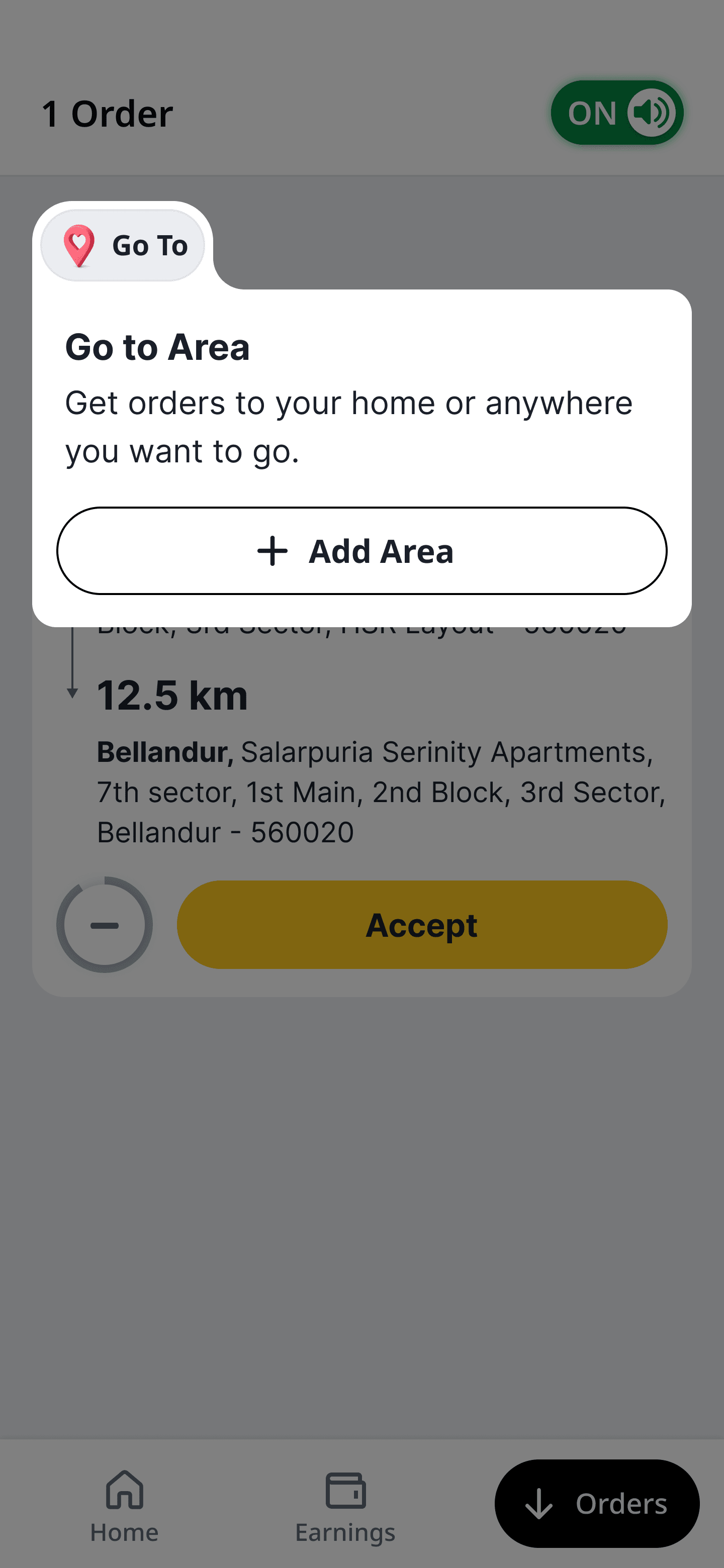
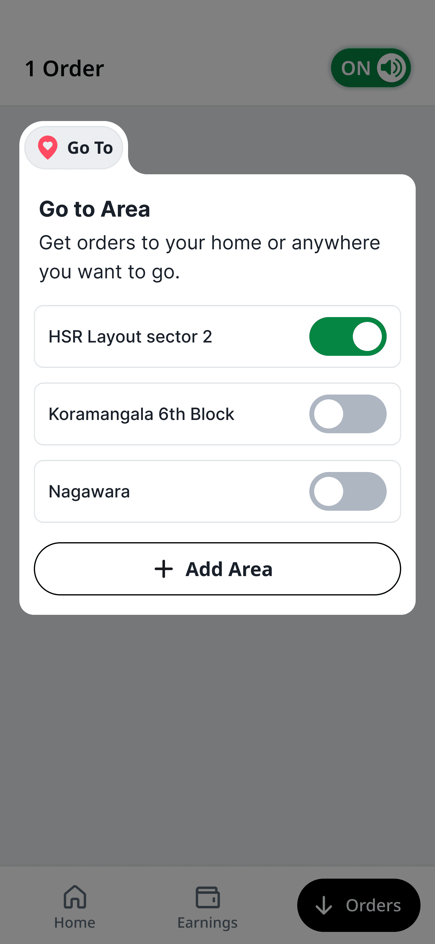
The existing experience was painfully reactive: go online → random orders arrive → react. A previous attempt to fix this, a feature called Go To Area, had only 12% adoption — largely because most drivers didn't know it existed.
What drivers actually told us was more revealing than any metric:
6 Days
Research
"I didn't even know Go To Area existed. If I had, I'd use it every night when I want to head home."

Full-time auto driver
6 yrs on the platform
18
Drivers
"This app is my monthly income. I only take trips above ₹200 — I want to earn more per ride, not just more rides."

Full-time auto driver
3 yrs on the platform
"I drive part-time. I want short orders, and I want to stay near my area."

Part-time driver
1 yr on the platform
💡 The insight that reframed the project
Drivers weren't rejecting orders randomly. They were optimising — for predictability, control, and earnings efficiency. Every driver had a clear intent when they went online. The system simply had no way to hear it.
My takeaway:
The system was reactive; the drivers were intent-driven. That mismatch was the real problem.
🧪 Hypothesis
If drivers are given control over the types of orders they receive, acceptance will rise — because the orders will finally match their intent.
The solution
🛠️ Product thinking & ideation
I used AI-assisted exploration to simulate a few marketplace scenarios — testing how different preference models might affect supply–demand matching before committing to a direction. Three concepts emerged:
AI-assisted Prototype
A
Orders screen with preference filters
A dedicated space where drivers choose the trip types they want (short, long, stay-in-area) and the live stream reshuffles to match.
B
Preferences captured during onboarding
The same controls surface on day one, so a driver's first session already reflects how they want to earn.
C
Preferences editable from the home screen
Adjustable mid-shift without digging through settings, because intent changes between the morning rush and the late-night ride home.
Introducing driver-controlled preferences into a live marketplace was not an easy sell. Stakeholders had real concerns:
"Will this reduce overall fulfillment?" Will they take regular orders?

Product Lead
Driver Product Team
"Will supply become fragmented across preferences?"

Manager - Business
Business Team
"This is an expensive build. What's your confidence level?"

Engineering Lead
Engineering Team
🧱 The phased experiment
Rather than defend a single big design, I reframed the work as a phased experiment — a way to learn cheaply before betting big. That reframe unlocked alignment.
Phase 1
Validate behavior
Designs to create:
Orders screen with filters
Filter setup flow
Resurface the Go To Area feature
Order card redesign
Bottom Navigation
Phase 2
Scale the system
Designs to create:
New services and features
Pickup-clarity improvements
Service manager
Order-card system at scale
Minimized bottom navigation
🧠 Core idea
Introduce an Orders Home with
Preference Filters + Bottom Navigation
Design: Phase 1 Validate behavior
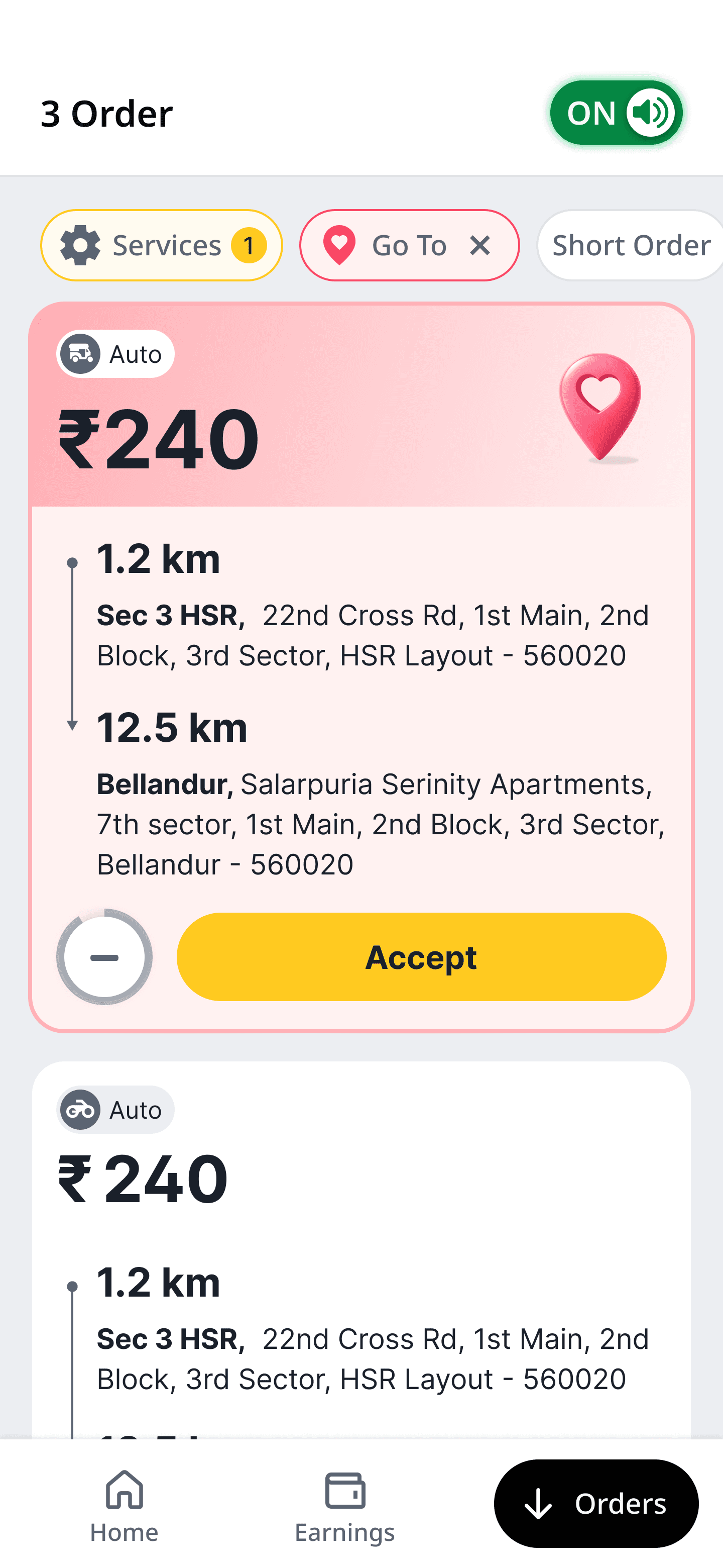
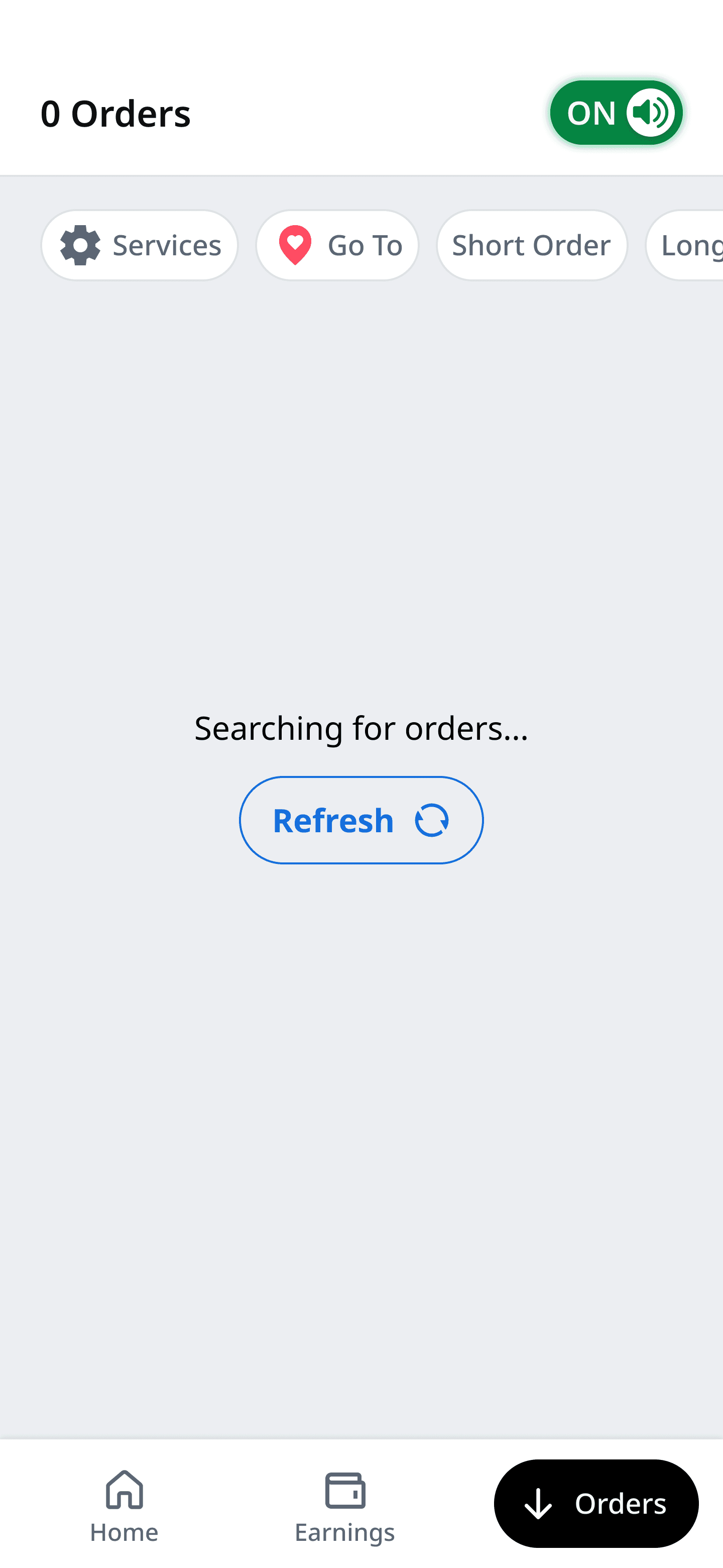
A dedicated Orders Home
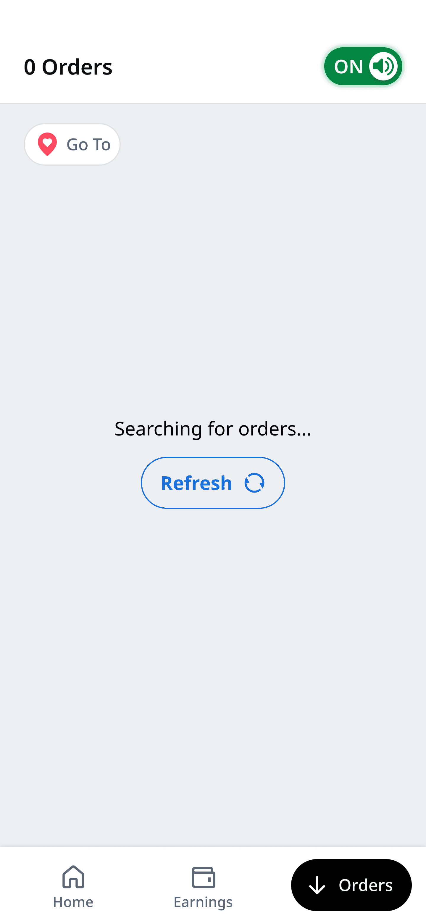
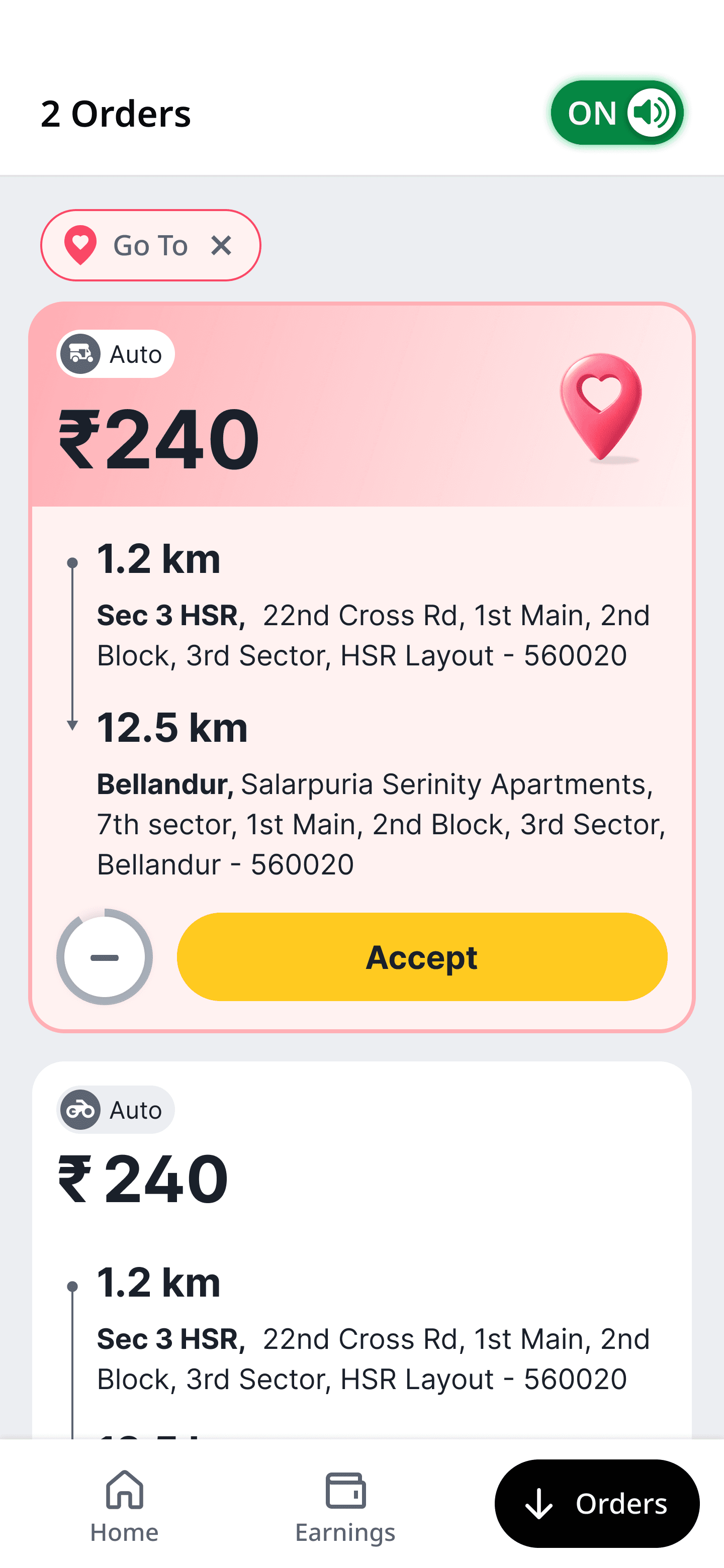
I introduced the bottom navigation so orders had their own mental space — separate from the home screen's noise. When nothing's coming in, the screen reads "Searching for orders…" instead of showing a blank empty state. A small detail, but it builds patience instead of anxiety.
Orders Home
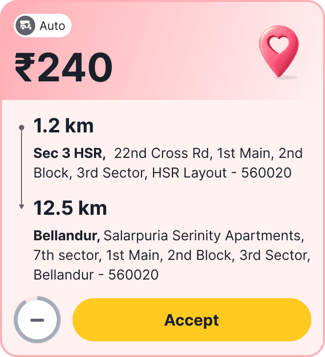
New Order Card
Setting up the filters
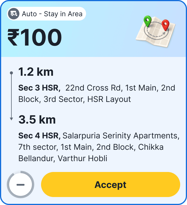
The filters let a driver shape their stream in seconds: Short Orders, Long Orders, Stay in Area, Go to Home. Selecting one immediately re-ranks incoming trips and shows a clear confirmation banner — "Short orders active — you'll see trips under 5 km near you" — so the driver always knows the system heard them.
Filter
Setting up the Filter
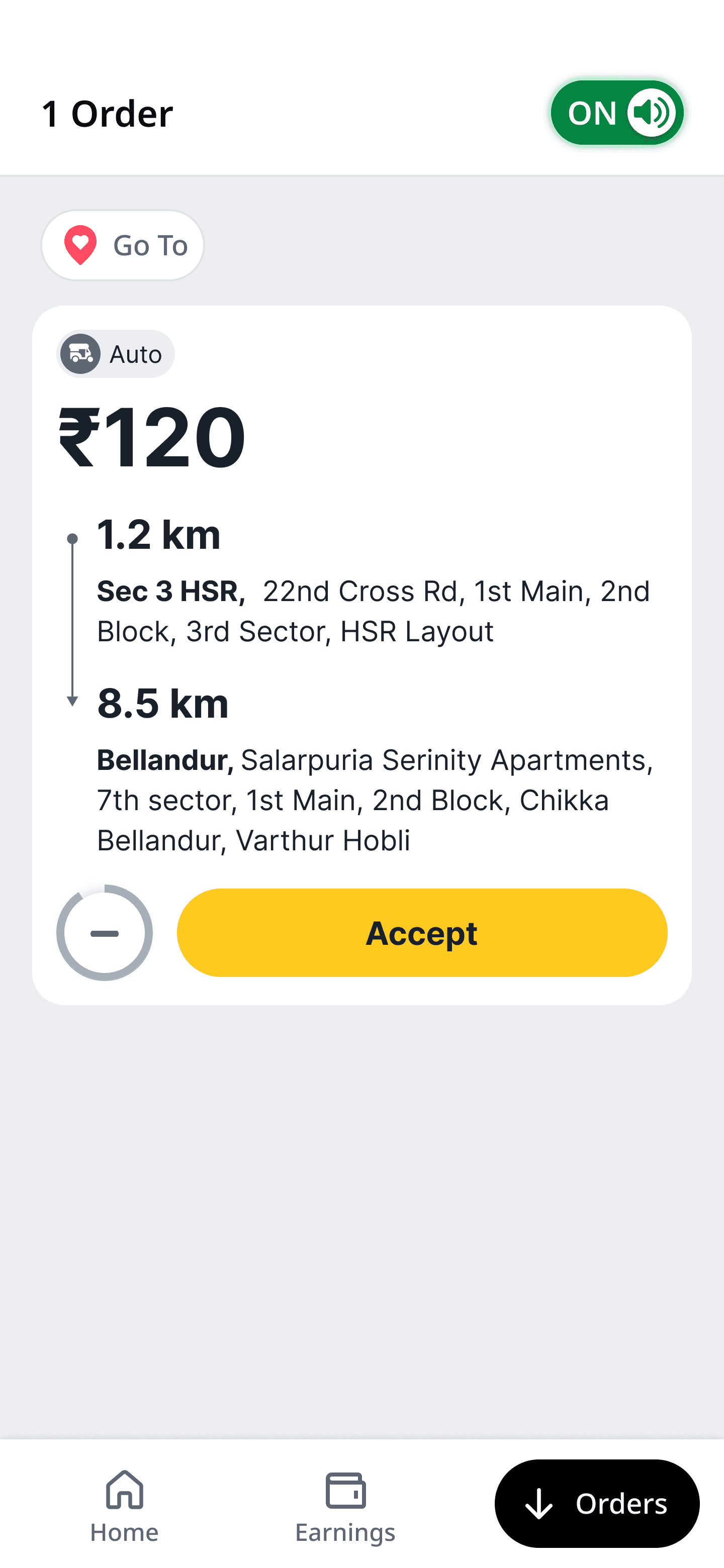
Thematic order card
We got the confidence and we scaled the bottom navigation to other services
Order card with theming
Identification icon
A thematic card and icon to identify the preferred order that was set by the driver
Tabs vs. no tabs — a risk-based call
My team initially pushed for separate tabs (All Orders / Preferred Orders). I pushed back. Tabs would create cognitive switching, and worse, drivers would multi-app to Uber or Ola while waiting for preferred orders to appear in a half-empty tab. I argued for a single stream where preferred orders surface to the top — keeping the driver's attention on our app, not a competitor's.
Tabs

V/S
No Tabs

Why I pushed for "no tabs"?
Cognitive switching
Two tabs mean two lists to track and a constant toggle between them.
Multi-apping
A half-empty "Preferred" tab leaves drivers waiting — and a waiting driver opens Uber or Ola.
No interaction
In one stream, preferred orders rise to the top on their own — no tab to open, no switch to remember.
Phased roll out
We took the design live in two cities — Bangalore and Hyderabad — across different Auto clusters before scaling to other metros and Tier-2 cities. Go To Area adoption climbed and idle time dropped.
41%
Filter adoption
−4 min
Idle time per shift
+8%
Order acceptance
Design: Phase 2 Scale the system
Scale to other services
Once the behaviour was proven, I scaled the same intent-led thinking across the rest of the ecosystem.

Bike Taki
Auto
Cabs
Adding new services and features
The model extended naturally across categories — Bike Taxi, Auto, Cabs — and into new earning levers:
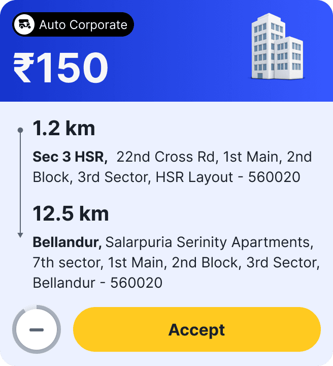
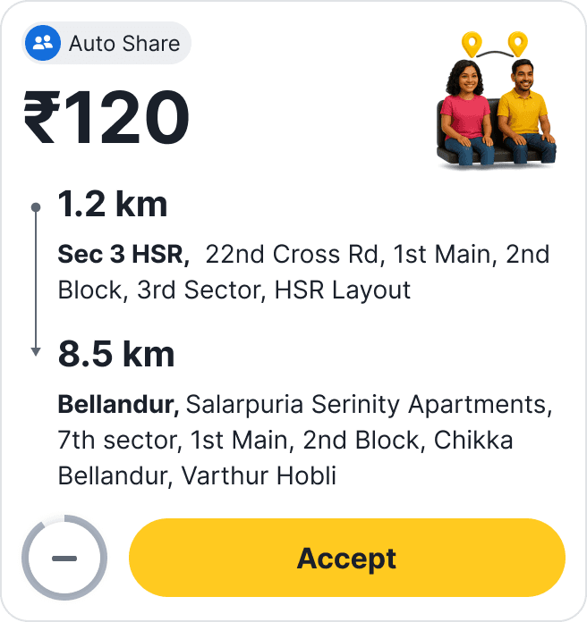
Services
Auto Boost
Auto Line
Meter Auto
Features
Short Orders
Long Orders
Stay in Area
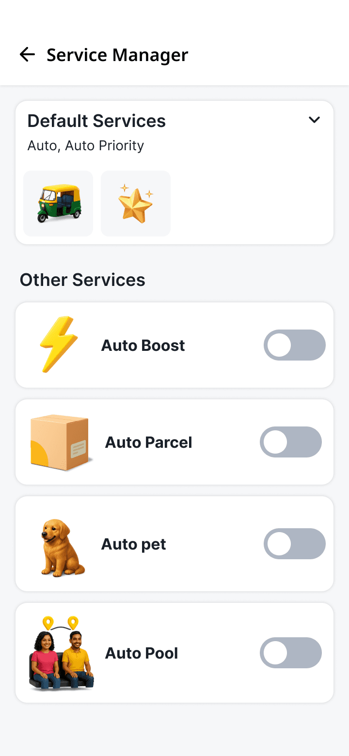
A service manager inside the order filters
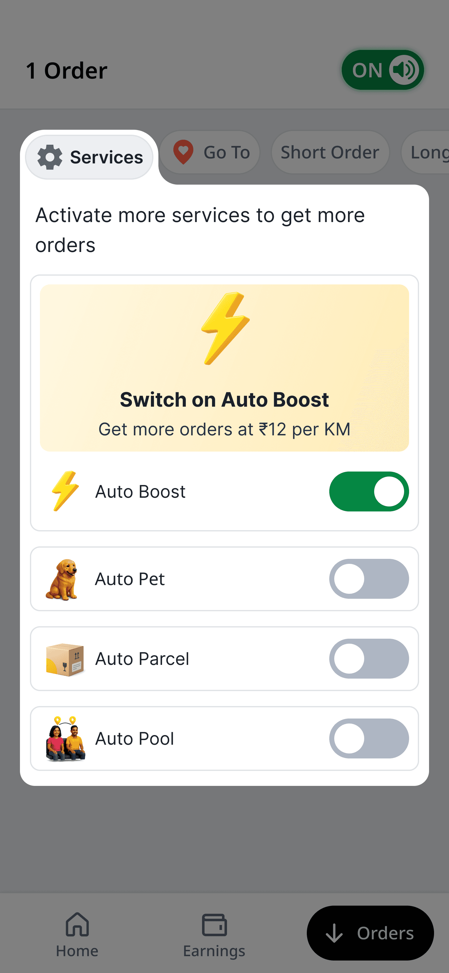
I unified services and preferences into a single Service Manager, so drivers manage what they earn from and what they receive in one place — Default Services up top, optional ones (Auto Boost, Auto Parcel, Auto Pool) as clearly labelled toggles below.
Service Manager
Orders Page
Setting up the services filter — and how the order card responds
Setting up a service is deliberately a two-tap job. A driver opens the Services pill, toggles on what they want to run that shift — Auto Boost, Auto Line, Meter Auto — and the change applies instantly to the live stream. No save button, no confirmation screen; the moment a service is on, the orders reflect it.
Order Page - Setting up the filter
Service expectation
Setting an expectation and explanatory of a particular service
When a driver enables a service, matching orders don't just appear — they surface higher in the stream with a subtle accent, so the right work rises to the top without hiding everything else. The card adapts to the driver's intent instead of asking the driver to adapt to the card.
Orders Page - Incoming Orders with Preference
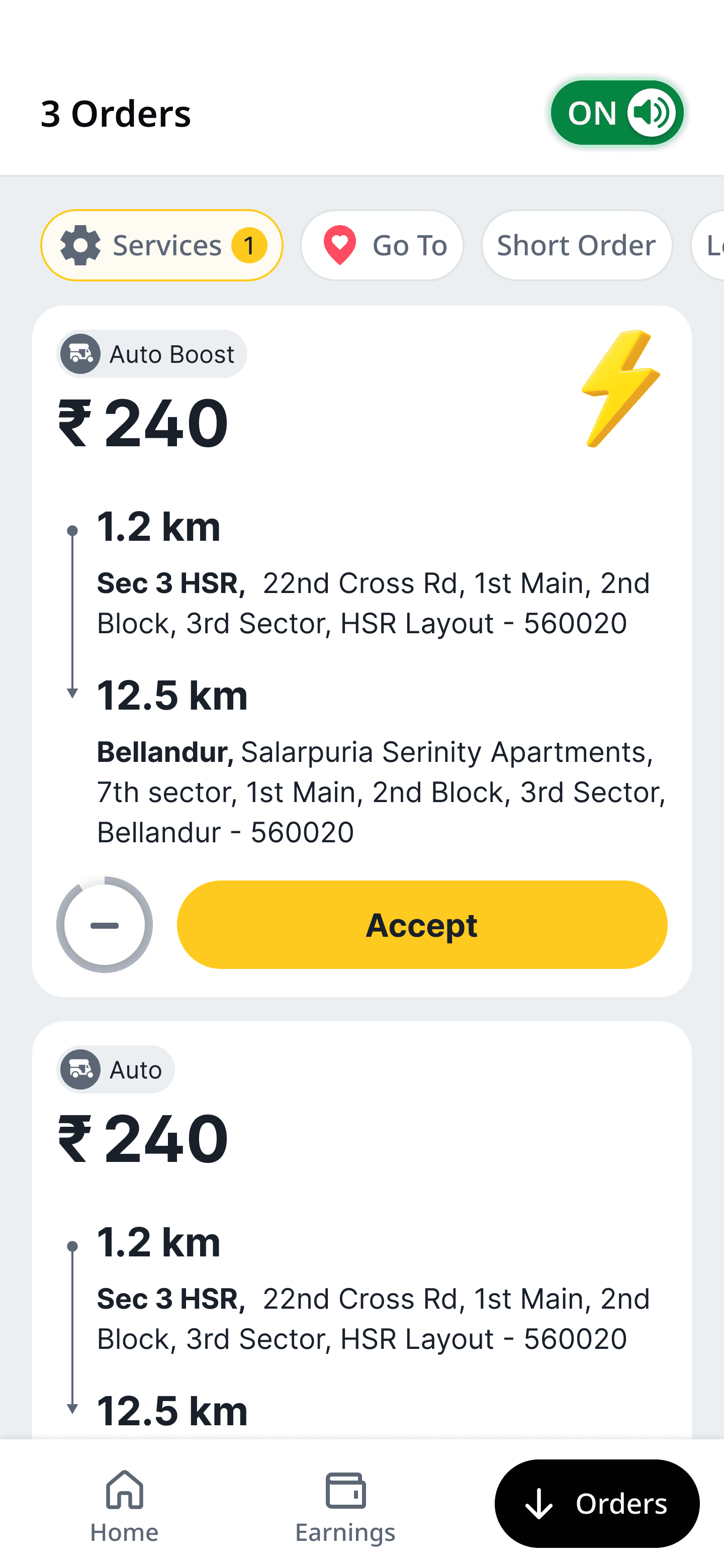
Preferred order icon
Icon for specific type of orders to differentiate between different services
Design decision on ambiguity — keeping services inside the Services pill
The ambiguous call was placement: each service as its own pill in the top bar (more discoverable), or all of them nested inside a single Services pill (one extra tap, but contained)? The team leaned toward exposing everything outside.
I argued against it. When every service is pinned to the bar, the ones a driver doesn't run become dead weight — a part-time driver who never takes parcels still stares at an Auto Parcel pill every shift. Over time that doesn't read as neutral; drivers resent the useless pill, and it bleeds onto the whole bar.
Nesting services inside one pill lets each driver curate their own set and keeps the bar calm regardless of how they drive. The cost is a rare extra tap to manage services — worth it to protect the everyday view.
Exposed services

V/S
Contained inside a pill

Birth of the new order cards — designing a system, not a screen
Once services and filters multiplied, one-off cards stopped scaling — every new service would have meant another bespoke design, and the visual language was already drifting.
So instead of drawing more cards, I built an order-card architecture: one base component with a fixed anatomy (service tag → fare → route → meta → action), with variants driven by data rather than redrawing. Service type swaps the tag and accent; order type changes the labelling; states like incoming, accepted, and expiring are toggles on the same component.
This is where I spent most of my mentoring time with the two junior designers — they could compose a new card by picking a variant and state instead of starting from a blank frame. The new order card wasn't a screen we shipped; it was a kit the whole app could build on.

Impact
📊 Impact & results
The headline question from the room — "Will this reduce overall fulfilment?" — was the one I most wanted to answer with data. It didn't. Because preferences re-ranked the single stream rather than hard-filtering it, supply never fragmented; drivers simply accepted more of what they were shown.
Metric
Before
After
Improvement
Order acceptance (post-login)
12.5 mins
7 mins
8%
Idle time per shift
23%
11%
-27%
Filter / Go To Area adoption
340/month
89/month
3.4x
🌟 Key outcomes
Acceptance rose without hurting fulfilment. The Product Lead's core fear didn't materialise — overall fulfilment held steady while acceptance climbed, because preferences shaped ranking, not availability.
Supply didn't fragment. The Business team's concern was answered by the single-stream decision: there was never a half-empty "preferred" tab for drivers to wait on, so they stayed in our app instead of multi-apping.
Go To Area went from invisible to essential. A feature sitting at 12% adoption became one of the most-used controls once it was pulled into the main flow — proof the original problem was discoverability, not desire.
Drivers felt in control. In follow-up conversations, the recurring word was "mine" — the stream finally felt like it belonged to them.
🧠 Closing thought
This started as a request to add a filter. It became a rethink of how a driver relates to their own order stream. The turning point wasn't a screen — it was reframing acceptance rate as a symptom of intent, then earning the room to test that belief instead of defending it. Filters, the Services pill, the order-card system: each one is just a way of letting a driver's intent reach the marketplace a little more directly.
"The orders didn't need to be smarter. They needed to listen."
✍️ A note on this case study
I've kept this focused on the decisions rather than the deliverables — what we believed, what we tested, and the calls where I went against the easier option (the single stream, the contained Services pill, the card system over more screens). Each of those went through far more iteration than fits on one page.
If there's one thing to take from it: I don't optimise acceptance, idle time, or adoption as separate dials. They all move when a driver feels in control of how they earn — so that's what I design for, and the numbers follow.
— Happy to walk through the full Figma file, the rejected directions, and the rollout data in conversation.
View projects from Flipkart


Designing a video app
One of my first UX project where I majorly worked on the widgets and user interface


Reducing the bounce rate
An analysis of how I mitigated the bounce rate by creating a fully new user experience


Reducing the returns rate
A project that provided significant insights into user perceptions of refurbished items